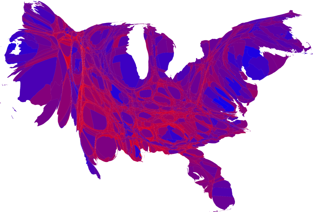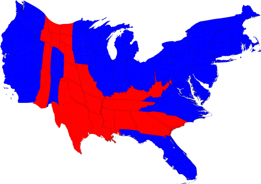
For this last election, this is a map of Red and Blue states whose size has been skewed proportional to the number of Electoral College votes they represent (based on population, but skewed to favor smaller states). It is revealing, to me, to see which states persist in a narrower world-view. Perhaps alternatively, they are states where designer narrow-issue focused propaganda does the most good (for the GOP). The danger in saying such things is that we are a purple country mostly, with a few patches of red and many patches (dare I say swaths) of blue. Here is the breakdown on that idea: